Small Offer – Designing Multi-Vendor Platform for Web and Mobile
Small Offer is a Syrian multi-vendor marketplace built to make buying and selling easier, faster, and more trustworthy. As the UI Designer, my role was to create a scalable interface under a strict two-month deadline, working closely with three developers while balancing speed, clarity, and design quality.
The Context
Small Offer started as a vision to build a simple, safe marketplace for local communities.
The team was small — UI Designer, Frontend Developer (Web), Frontend Developer (Mobile App), and Backend Developer — and the timeline was extremely tight: only 10 weeks until launch, with the last 2 weeks reserved for testing.
This meant we had to rely on small, fast iterations to ensure we could design and build simultaneously, making decisions quickly without compromising usability.
Role
Product Designer
Language
Arabic
Skills
UI Design, Collaboration, Design Systems, Marketplace UX
The problem
Local marketplaces in Syria share common UX problems such as overwhelming category structures, cluttered UI, poor search, and low trust between buyers and sellers.
Users don’t stop using these platforms because of a lack of content — they stop because the experience feels difficult, messy, or untrustworthy.
The Challnge
The main challenge was simple: a strict deadline and a lack of clarity regarding the product requirements and business goals.
How do you deliver a full marketplace UI while development and design are happening at the same time?
Before Design
Before starting design in Figma, we had to establish a structure that allowed us to deliver quickly while ensuring development matched the UI almost perfectly.
After several team meetings, we decided to work in small modules. Instead of completing the full design and then beginning development, we divided the project into features so we could stay clear and aligned on the needs of each part.
I needed to start by creating a strict UI system early (colors, spacing, layout rules, card patterns), ensuring developers could proceed even before all screens were delivered.
We focused on clarity and usability over decoration, saving time while improving the product’s usability.
Client meeting & Clear Business goals
Before starting with the design we tried to meet with the client couple of times to understand the scope of the project and the needs of the business like: Build a local marketplace that feels trustworthy, provide a simple posting experience, and make sure that the seller and the buyer can contact each other easily and upgrade their products without the need of complex payment methods.
One of the things we had to deal with is the lack of research time, that’s why we tried to do some desk research to understand the market standards by analyzing their competitors like (Paloma, Hatlek Deal, … etc) focusing on:
- category structure
- Search experience
- Posting flows
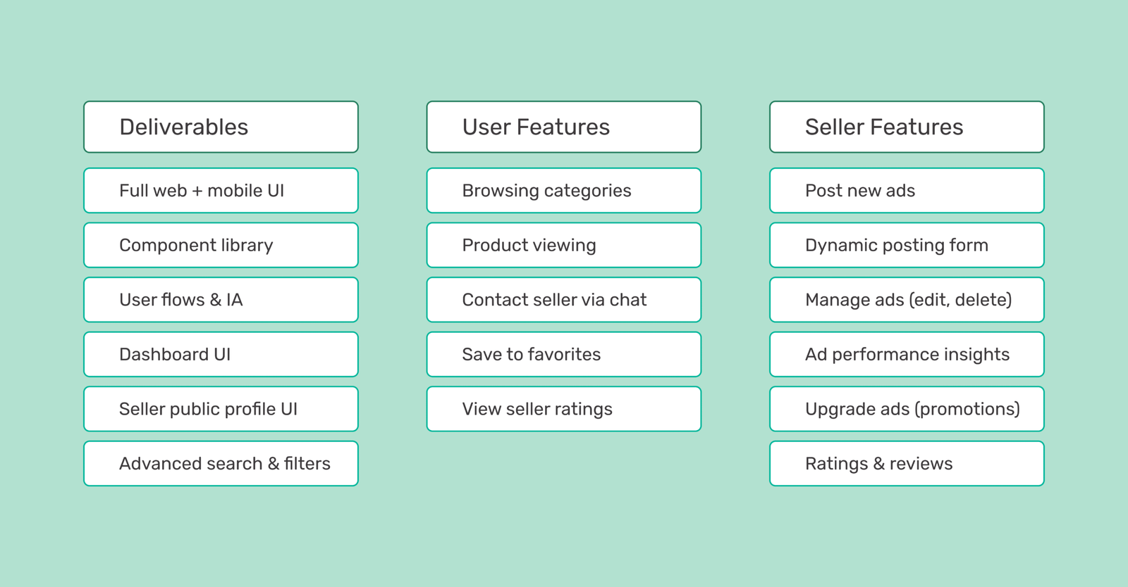
Feature Prioritization
For V1, we focused on a few features that mattered most to users, such as: advanced search, the posting system, the chat system, and upgrading ads to reach more people.
We centered the design around three main roles — Buyer, Seller, and Admin — to maintain alignment and prevent unnecessary revisions later.
But how can we make sure we meet the goals while designing under a tight deadline?
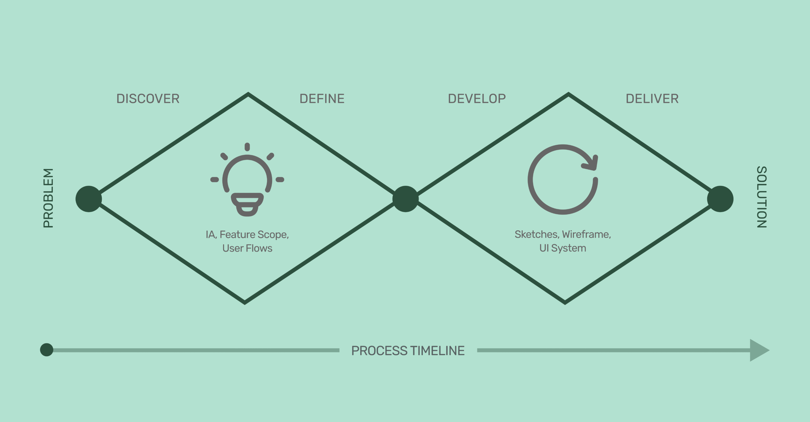
Design Process
We followed a Double Diamond process, but adapted it for a fast-paced environment where design and development needed to move in parallel. Instead of spending long weeks in each stage, we compressed the cycle while keeping its core principles.
1. Discover — Understanding the landscape quickly
We began by gathering clarity from every possible source in a short time frame:
Client meetings to understand business goals, constraints, and expectations.
Market and competitor research (Paloma, Hatlek Deal, international benchmarks like OLX and Etsy).
Identifying recurring user pain points, especially around search difficulty, overwhelming categories, and trust issues.
Even with limited time, this phase helped us understand what problems actually mattered, and which solutions would have the most impact in V1.
2. Define — Turning insights into structure
Once we understood the core problems, the next step was to turn them into a clear, buildable structure:
Information Architecture (IA) for both web and mobile, covering categories, filters, dashboard flows, and posting logic.
Feature scoping, prioritizing high-impact features to fit the timeline (posting, search, chat, ad upgrades).
User flows that mapped every action a buyer or seller might take — from posting a new ad to chatting and managing their shop.
This phase ensured the whole team (UI + frontend + backend + mobile app) stayed aligned on what we were building, reducing revisions later.
3. Develop — Fast iterations with a system-first mindset
Instead of designing screens randomly, we built the design in layers so development could start early:
Low-fidelity sketches to explore layouts quickly.
Wireframes for the main flows (search → product → chat, posting system, dashboard).
A strict UI system including spacing, color tokens, typography styles, card structures, and reusable patterns.
Responsive rules ensuring web and app share the same logic but adapt gracefully to different sizes.
By designing in modules, we allowed the developers to start coding parts of the UI while the rest was still being designed.
4. Deliver — Final interface ready for development
The final phase focused on:
High-fidelity UI for both mobile and web.
Variants and components to speed up development.
Clear developer documentation (naming conventions, spacing rules, behavior logic).
Weekly handoffs with explanations for interaction details and edge cases.
This approach allowed us to design and build simultaneously without losing quality or consistency.
Main Pages
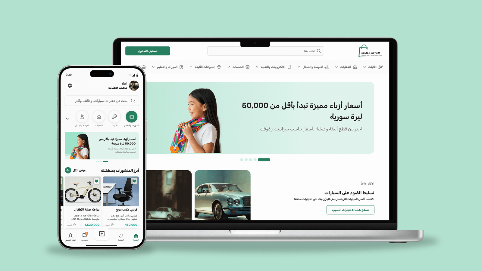
1. Home Page (Web + Mobile)
The home screen focuses on clarity and fast discovery. A simple hero section introduces the platform with helpful promotions, while the search bar is placed prominently since users rely heavily on search. Categories are displayed in a clean, scannable layout, supported by recently added items and a “Trusted Stores” section to build confidence. A clear “Post Your Ad” button encourages immediate engagement. The design adapts smoothly between web and mobile, shifting from a wide exploratory layout to a focused stacked interface.
This structure solves the user problem of feeling overwhelmed by offering a clean starting point and simple ways to find what they need quickly.
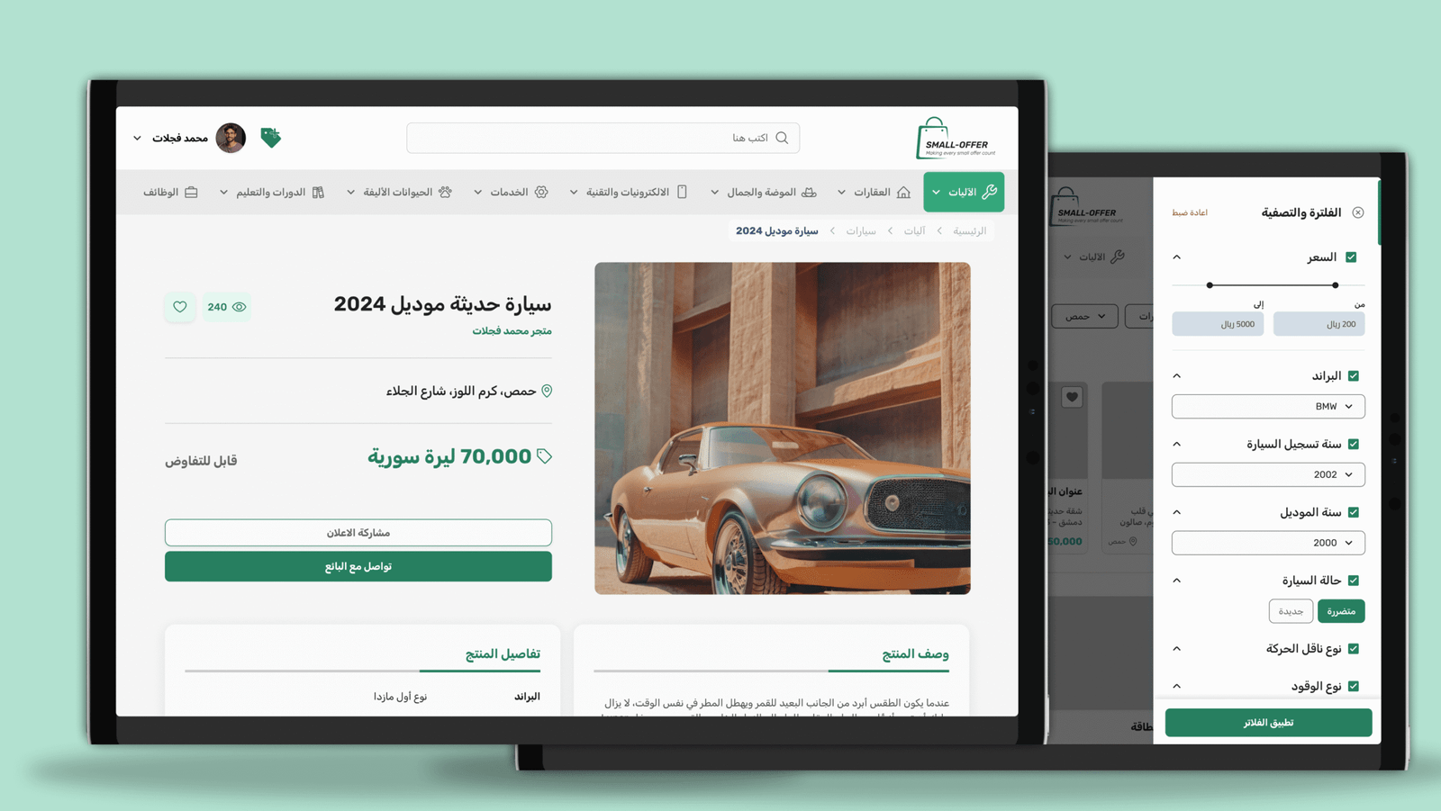
2. Product Page
The product page is designed for trust and quick decision-making. It includes a clean, responsive image gallery and a visible seller card that links to the seller’s profile. Product details, location, views, and posting date are organized clearly to reduce uncertainty. “Chat with Seller” is the primary action, with “Share” as a secondary one. Suggested items help keep users engaged even if the current item isn’t the right fit.
This page solves users’ trust issues by showing transparent information and making seller communication effortless.
Dynamic Search Filter based on the category
One of the biggest challenges was handling a large, constantly changing category structure. To solve this, we designed a dynamic filtering system that adjusts based on the selected category. Instead of showing every filter to every user, the system reveals only the filters relevant to the item type. This kept the interface simple, reduced scrolling, and made it easier for users to refine their results quickly.
This approach helped solve the problem of overwhelming category lists by turning the search experience into something clean, focused, and easy to use.
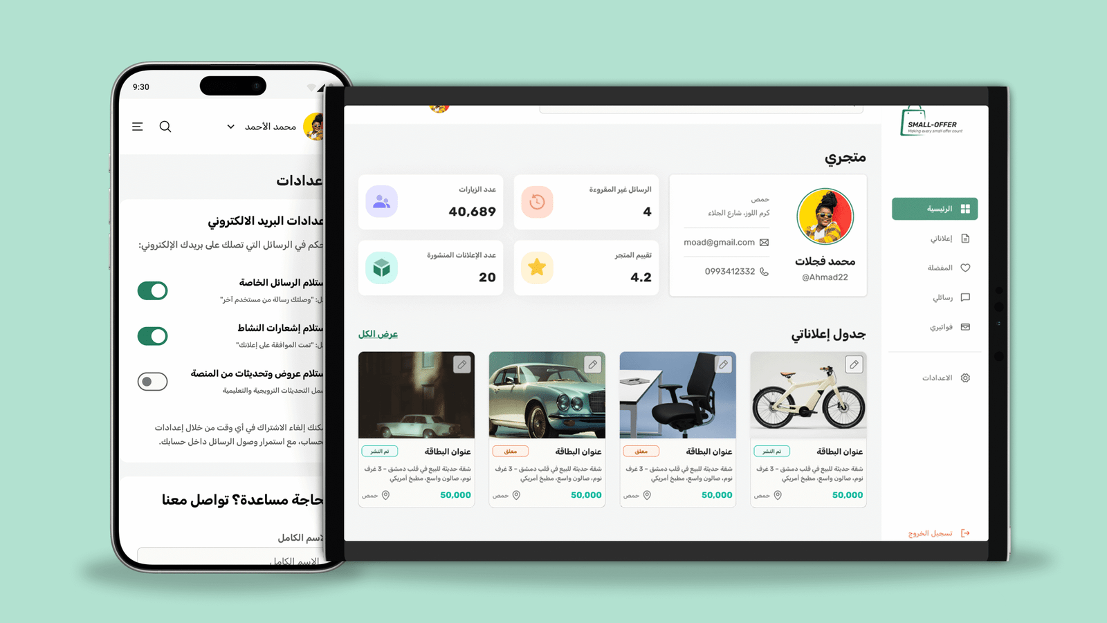
3. User Dashboard
The dashboard is structured for quick and efficient seller management. Users see their number of posts, views, and unread messages at a glance, with quick access to saved items, the inbox, and a responsive table of all posts with their status. The mobile version becomes a simple tab layout for faster navigation.
This solves the problem of messy seller tools by giving users a clear, organized, and predictable place to manage all their activity.
4. Chat System
The chat system provides a simple, fast communication experience. Mobile users switch smoothly between chat list and conversation, while desktop users get a familiar messenger-style layout. Clean message bubbles, timestamps, and listing previews help keep conversations clear and contextual. Seen indicators reinforce transparency.
This system solves the problem of unreliable communication by offering a familiar, clean, and transparent chat flow across all devices.
What I Learned From Working Under Pressure
Small Offer taught me how to work fast without losing clarity.
Staying aligned with developers helped avoid blockers, and prioritizing core features kept us within the deadline. I learned that simple, system-based design saves time, reduces bugs, and makes development smoother. Flexibility was essential, especially when adapting to backend constraints, and quick decision-making kept the project moving.
This project strengthened my ability to deliver clean, efficient UI under real startup pressure.
Expected Value (Pre-Launch)
Even before launch, the design brings clear user value.
Structured categories and a focused home improve discovery, while simpler posting flows increase the chance of completing an ad. Seller identity and ratings help build trust, and a clean dashboard supports better retention for sellers. The mobile-first layout improves browsing comfort, and the modular UI prepares the product to scale easily.
The design is built to launch quickly — and continue growing smoothly.